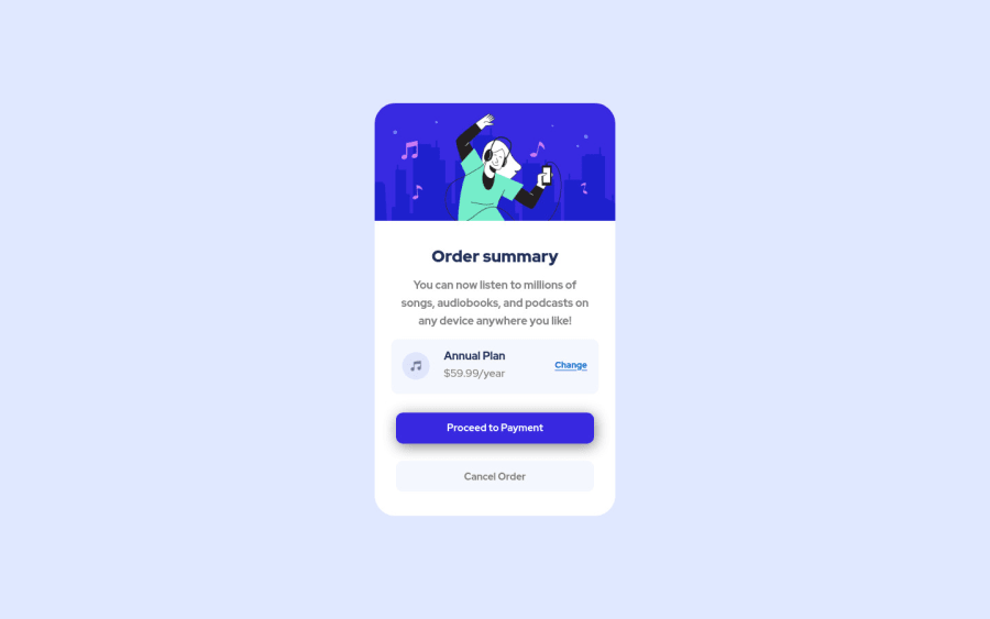
Design comparison
Solution retrospective
Feel free to tell me the things that I need to improve. I'm a beginner frontend developer so your thoughts will teach me a lot.
Community feedback
- @DainaaPosted about 3 years ago
I think it's great! Take a look at bezier-curves to see how you can make the background have that wavy effect. Or, use two circles and position them in CSS. :)
Marked as helpful2@Tiyana19Posted about 3 years ago@Dainaa yeah thanks for your suggestion. I added the background. well, can you please tell me how can I make a wavy effect with two circles?
0@DainaaPosted about 3 years ago@Tiyana19 Sure! Here's an example, quickly put together and best viewed at widths 1000px or lower. https://codepen.io/dainaa-the-lessful/pen/dyRQQwG?editors=1100 ^ Go to the link and change the colors of all the elements to see where they are, and you'll get an idea of what's going on. It's a quick hacky sort of way to get a decent background if you've got fixed dimensions. Play around with some CSS and you can do a bunch of things this way.
Also, my bad about bezier-curves, I forgot that they're a timing thing and not a drawing thing, so you can't use those to draw on your webpage. Oopsie :)
If you need perhaps something more detailed, I'd recommend you read up on HTML Canvas on w3schools.com, or similar.
Marked as helpful1@Tiyana19Posted about 3 years ago@Dainaa Thank you so much... I got to know this new way to set the wavy look. but I want to ask you one more question, in your pen you set position to absolute to both circles but then why didn't you set position to a relative in their parent element?
1@DainaaPosted about 3 years ago@Tiyana19 You could, technically we try to position absolute elements relative to their parents. If no parent with a position property is found, then the absolute positioning is applied relative to the viewport. I was able to set up the circles to convey the idea without it, but you're right it is probably good practice to do so :)
Marked as helpful1@Tiyana19Posted about 3 years ago@Dainaa Thank you so much 😊 You solved my one of question actually few days ago I set a card element to center using bootstrap class it was also position to absolute but mine element was also not had any parent element so I also can't set the position relative but it still worked so I was really confused that how does it happen. Bot now I understand 😃
1 - @nicm42Posted about 3 years ago
This looks great. Your class naming and CSS organisation are good, so I could tell which each bit was referring to in the CSS without having to look at the HTML. I really like the focus states on the buttons.
In your GitHub readme, the screenshot isn't showing. At the moment you have:
(./Images/screencapture.png)
What you want is something like:
![Desktop](./images/screencapture.png)
(with a small i on images, rather than Images). The bit in square brackets is the alt text.
Marked as helpful1@Tiyana19Posted about 3 years ago@nicm42 thank you so much... I also thought, why my screenshot is not showing but now it works. but I don't understand that thing in the square brackets can you please explain it to me...
0@nicm42Posted about 3 years ago@Tiyana19 It's how you do images in markdown. It's like having your image src in normal brackets and your image alt in square brackets with an exclamation mark in front.
In HTML you'd have
<img src="image.jpg" alt="This is an image">
In markdown you have
![This is an image](image.jpg)
Marked as helpful1@Tiyana19Posted about 3 years ago@nicm42 ok I understand what you said but then why did you put [Desktop], I mean it does that images that are in a folder and that don't have any alt text, their alt text would be [Desktop]? By the way, Thank you so much I didn't know about this thing before.
0@nicm42Posted about 3 years ago@Tiyana19 Images don't have alt text intrinsically, you have to add it in HTML or markdown. I put [Desktop] because I copied one of mine and forgot to change it to something that made more sense on its own :) It means that the alt text will be Desktop.
Marked as helpful1 - Account deleted
Its good not bad Keep doing challenges Good luck 👋
2
Please log in to post a comment
Log in with GitHubJoin our Discord community
Join thousands of Frontend Mentor community members taking the challenges, sharing resources, helping each other, and chatting about all things front-end!
Join our Discord