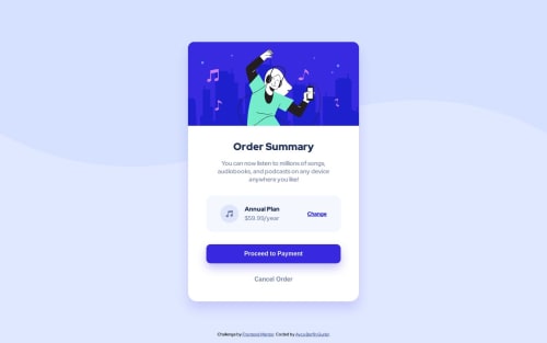
Design comparison
Solution retrospective
I had a hard time figuring out the middle part, not fully satisfied still! I couldn't center it, it came too long that it cross the button size or too short. Any feedback will be really appreciated!
Community feedback
- @danielmrz-devPosted 11 months ago
Hello, @aybegu!
Can you elaborate on your question? I didn't understand what you mean by middle part. Which part exaclty are you refering to?
By the way, it looks very good to me!
1@aybeguPosted 11 months ago@danielmrz-dev Thank you Daniel! I meant the annual plan part, the whole div to be exact. I couldn't apart them correctly, they are too in the middle and close to each other unlike the example. I tried padding and margin but it didn't worked like i hoped!
1@danielmrz-devPosted 11 months agoOk, now I got it @aybegu !
Here's how I did that part:
- First, I created a
flex-container
and 3flex-items
. The first item is themusic image
, the second isannual plan
+$59.99/year
and the third is the buttonchange
.
Then I set the container like this:
display: flex; justify-items: space-between;
Then I set a
margin-right: auto
in the second item (annual plan
+$59.99/year
).And it's done!
I hope it helps you!
1 - First, I created a
Please log in to post a comment
Log in with GitHubJoin our Discord community
Join thousands of Frontend Mentor community members taking the challenges, sharing resources, helping each other, and chatting about all things front-end!
Join our Discord