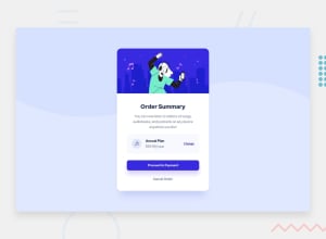
Design comparison
Solution retrospective
Had troubles with decisions for the background image in reference to the media change wasn't sure if I should just do 375px or go with 680px for tablets as well so I went with 680px but was i supposed to just do 375px? Also was not too sure what color to go with for general text as it wasn't black nor specified in style guide so I went with my best judgement on a dark grey was I supposed to stick with the colors given only? Lastly in with Accessibility issues I had in the past I tried to fix them this time around if they don't work properly any tips on how to approach future projects to avoid them?
Community feedback
Please log in to post a comment
Log in with GitHubJoin our Discord community
Join thousands of Frontend Mentor community members taking the challenges, sharing resources, helping each other, and chatting about all things front-end!
Join our Discord
