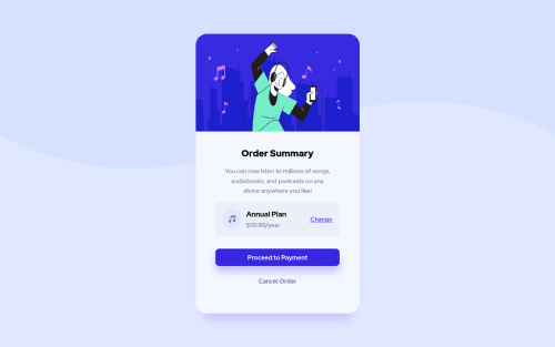
Design comparison
SolutionDesign
Solution retrospective
As I am a beginner, I'd truly and greatly appreciate any sort of constructive criticism/feedback. God bless.
Community feedback
- @vanzasetiaPosted over 3 years ago
👋Hi jackson!
👍 Good job on completing your first challenge!
Some feedback to improve this solution:
- Wrap all the content in a landmark. Use
main
tag to do that. - Heading must go in order. You need to use
h1
first. You can make the Order Summaryh1
in this case. - The Annual plan, is not a heading, it can be a paragraph or a list item. If you think this is important consider using
strong
tag. - My recommendation for the hero illustration is that you use
img
tag instead of using CSS background. I found out that this method is easier because, you don't need to care about the size (since it has the same size on all screen sizes) as long as you set theimg
styling to this:
img { display: block; height: auto; max-width: 100%; }
- For the
button
elements, I recommend to set thetype="button"
to make sure it behave the same across the browsers. - Never wrap a text in a meaningless tag like
div
orspan
. Usediv
orspan
for styling only. You should wrap the$59.99/year
in a more semantic tag likep
.
That's it! Hopefully this is helpful!
Marked as helpful0 - Wrap all the content in a landmark. Use
- @exequielarroyoPosted over 3 years ago
Great layout as a beginner. ❤ I hope you can try reading some of the reports accessibility and HTML issues
Marked as helpful0
Please log in to post a comment
Log in with GitHubJoin our Discord community
Join thousands of Frontend Mentor community members taking the challenges, sharing resources, helping each other, and chatting about all things front-end!
Join our Discord