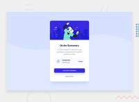
Design comparison
SolutionDesign
Solution retrospective
I build the desktop version first then i add media query to make it responsive for mobile. any suggest about which way is better to begin with
Community feedback
- @CyrusKabirPosted over 2 years ago
hello my dear friend ♥ you did good on this challenge and here some improvements :
- it's better approach to start with mobile first (or mobile first approach) and use min-widht instead of max-width in @medias ;
- if you look to main design in card we have more paddings and margin to have a card closer to design you can use image coparison slider or this browser extension Perfect Pixel
Marked as helpful0 - @denieldenPosted over 2 years ago
Hi Mohammed, great work on this challenge! 😉
Here are a few tips for improve your code:
- add
background-size: containto the body fox fix the image bg - add
maintag and wrap the card for improve the Accessibility - remove all unnecessary code, the less you write the better as well as being clearer: for example the
divcontainer of image and comments - remove all
marginfrom.order-cardclass because with flex they are superfluous - add
transitionon the element with hover effect - instead of using
pxuse relative units of measurement likerem-> read here
Overall you did well 😁 Hope this help!
0@Mohammedabbas7Posted over 2 years ago@denielden I appreciate your feedback that is so helpful.But the second feedback i didn't get it
1@denieldenPosted over 2 years ago@Mohammedabbas7 What second feedback do you mean they haven't received?
0@Mohammedabbas7Posted over 2 years ago@denielden add main tag. In my markup i added the main tag
1 - add
Please log in to post a comment
Log in with GitHubJoin our Discord community
Join thousands of Frontend Mentor community members taking the challenges, sharing resources, helping each other, and chatting about all things front-end!
Join our Discord

