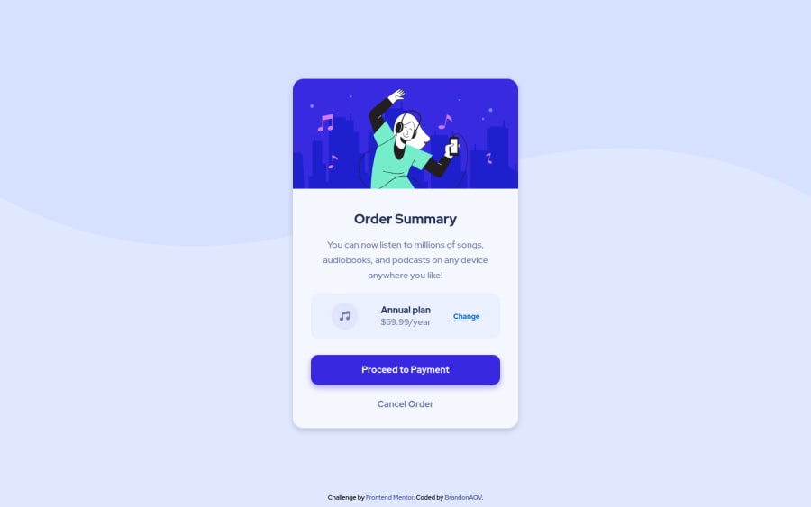
Design comparison
SolutionDesign
Community feedback
- @MecosLBPosted almost 2 years ago
Hey Brandon! Nice job, your solution looks pretty cool! 👏
Just a reminder to use the :hover pseudo-class to achieve the active state effects some components as the buttons require on this challenges. 😉
Also, great job using display: flex; flex-direction: column;, but sometime there's no need to use it. E.g: <button> with display: block; can achieve the same positioning you were looking for with the flex-direction: column; 👌
Keep coding 💻
0
Please log in to post a comment
Log in with GitHubJoin our Discord community
Join thousands of Frontend Mentor community members taking the challenges, sharing resources, helping each other, and chatting about all things front-end!
Join our Discord
