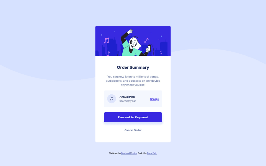
Design comparison
Solution retrospective
I enjoyed this challenge a lot. Please, any feedback is welcome.
Community feedback
- Account deleted
Hi there 👋
Congratulate on finishing your project 🎉. You did a great job 🔨
I give some suggestions that I hope help you take your project to the next level 📈.
- Let's add more
border-radiusto the card - Also don't forget to add
box-shadowto it
Happy coding ☕
Maqsud
1 - Let's add more
- @NaveenGumastePosted about 3 years ago
Hay ! Good Job CodingTube
These below mentioned tricks will help you remove any Accessibility Issues
-> Add
Maintag after body like it should be your container. For 1st heading orh1tag, use header tag and then inside the header put yourh1orh2etc . But use header tag only once in main heading element.Keep up the good work!
0
Please log in to post a comment
Log in with GitHubJoin our Discord community
Join thousands of Frontend Mentor community members taking the challenges, sharing resources, helping each other, and chatting about all things front-end!
Join our Discord
