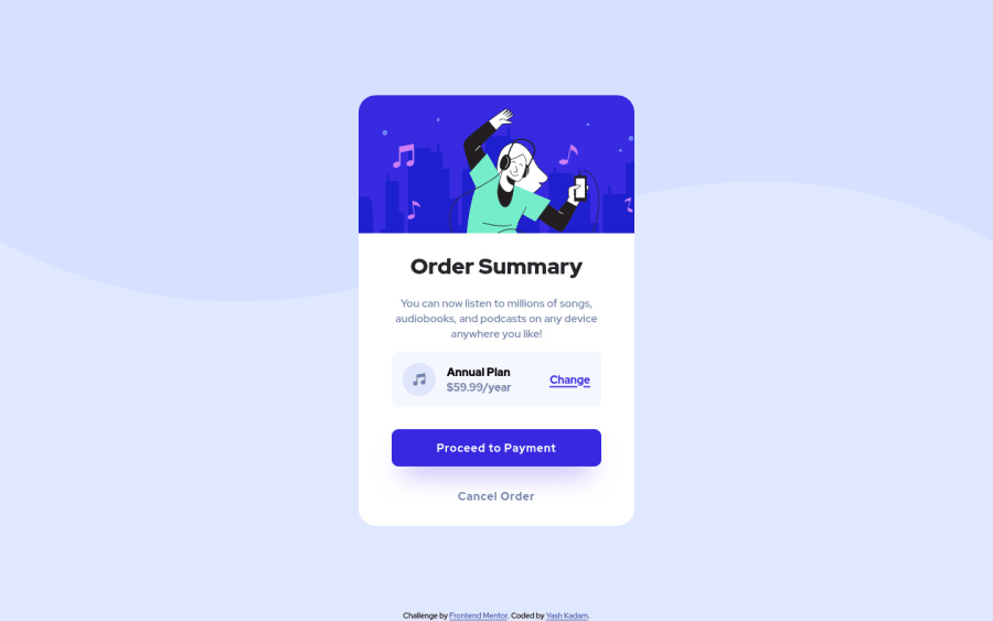
Order Summary Component using Flexbox & Sass
Design comparison
Solution retrospective
Hi everyone, This is my solution for Order Summary Component.
Had a ton of problems in actually fitting the main SVG in container, I did look it up and was able to do somehow, but I think there might be a better way. Will be studying on it more.
Feedback Welcome !
Community feedback
- @vanzasetiaPosted almost 3 years ago
Hi, Yash! 👋
Good effort on this challenge! 👍 It's great that you leave all the
altempty for all decorative images! 👏About the image element, it's actually the problem of the
imgtag, not the SVG.imgelement by default isdisplay: inline;so, to make it easier I like to change the display of it toblockorinline-blockdepending on the situation. Also, addmax-width: 100%so that it's always fill the entire container.There are two things that can be done better.
- In your CSS, I noticed this selector
.cardContainer .cardContent .pricingCard .contentPricingwhich would be much be ascontentPricing. It's a good practice to keep the CSS specificity as low and flat as possible. High specificity will make your stylesheet hard to maintain. - There's no need to have an
aria-labelif the button or the link has already text content in it. Also, I would prefer using actual text content because it is translateable by Google Translate.
That's it! Hope you find this useful! 😁
Marked as helpful1 - In your CSS, I noticed this selector
- @AlazarG19Posted almost 3 years ago
nice solution just increase the your main container and thats it
1
Please log in to post a comment
Log in with GitHubJoin our Discord community
Join thousands of Frontend Mentor community members taking the challenges, sharing resources, helping each other, and chatting about all things front-end!
Join our Discord
