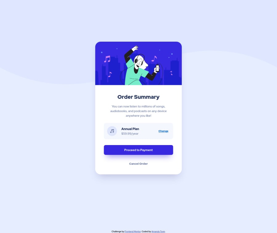
Design comparison
Solution retrospective
This is my first project with this community. What tools are others using to measure design components? I just estimated layout. I know there has to be a better way. Thanks!
Community feedback
- @pikapikamartPosted about 3 years ago
Hey, awesome work on this one and congrats for you first challenge here in fem^^. The site looks great in general, just needed it to be centered for desktop state and make the layout adaptive in mobile state.
Mohamed Adel already gave great feedback on this one, just going to add some suggestions as well:
- Don't use
height: 100%
on thebody
since it is relative to the viewport, usemin-height: 100vh
for better scalability as this lets the element expand. - No need to add
width: 100%
on thebody
as well since by defaultblock
element uses 100% of the width. Also it would be better to remove themin-width
so that even small screen-width-mobile-phone users uses the site, it will still look fine for them with no horizontal scroll. header
not needed in here, remove unused element in the markup.- On the
main
since you are making the layout center usingmargin
on the.order-container
, it is not consistent enough. Instead you can remove that and on thebody
tag add:
align-items: center; display: flex; flex-direction: column; justify-content: center; min-height: 100vh;
This way the layout will be properly centered.
- When using
img
tag, always include thealt
attribute even if the value is empty or not. By not adding this, screen-reader will instead read the source path of theimg
which you don't want. So always include it. - You don't need to use
ul
on theannual-plan
section since those are not really list items. Adiv
orsection
would be fine. Also theannual-plan
text should be a heading tag since it gives information on what the section would contain. - Lastly, adding a
cursor: pointer
to the 2 buttons so that it will feel more natural in desktop layout.
Aside from those, great job again on this one.
Marked as helpful1@atoopdevPosted about 3 years ago@pikamart Thank you for taking the time to provide detailed feedback. I did not feel comfortable with a couple of the options I choose - such as the <ul> - and your suggestions are helpful. Thank you very much.
1 - Don't use
- @mo-adel99Posted about 3 years ago
if its an image you would have to estimate the design mostly, another way is to receive a figma or sketch file where all dimensions, font-sizes and colors are determined by a designer even spacings are there too if the designer was working on some sort of a grid
0@atoopdevPosted about 3 years ago@mo-adell Okay, I was using the project starter files without those options so its good to know I was more or less doing the right thing.
0
Please log in to post a comment
Log in with GitHubJoin our Discord community
Join thousands of Frontend Mentor community members taking the challenges, sharing resources, helping each other, and chatting about all things front-end!
Join our Discord