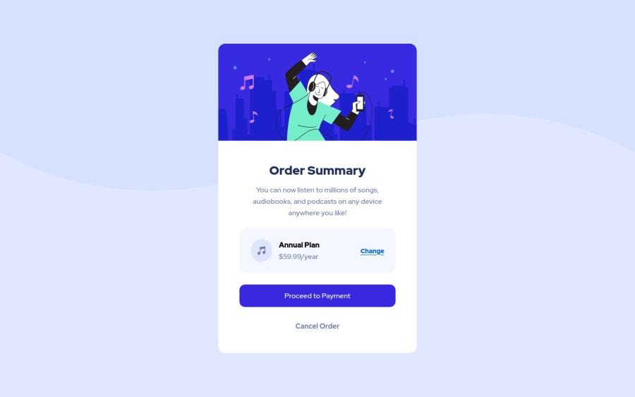
Design comparison
Solution retrospective
THIS IS MY SECOND ATTEMPT... I spent my whole weekend learning how to replicate this with zero knowledge in HTML and CSS. I tried using only Google, and no YouTube tutorials.
I am still trying to grasp media queries and how to make everything responsive.
If anyone has any suggestions on how I can write my code differently, please let me know! Any feedback out of your time is greatly appreciated!
Community feedback
- @darryncodesPosted over 3 years ago
Hi Ken,
Great effort, really close to the design - well done!
Some fundamentals:
Consider using relative units instead of absolute units for responsive design. I can see you have used rem in places, you'll need to change the root font-size with media queries to see the magic happen. Here is some information to get you started:
And finally an awesome guide:
All the best with your journey!
Marked as helpful1@kenreibmanPosted over 3 years ago@darryncodes Thank you for the detailed comment with helpful links as well. I will definitely look into all of the resources you provided.
0 - @beslerpatrykPosted over 3 years ago
Awesome job Ken! I recommend you to get more familiar with CSS display properties such as grid and flex. It will definitely help you set up the proper layout for your components. I looked up your HTML code. You should put elements in div tags only where there is a need for that. For example, putting h1 tag inside div creates unnecessary lines of code. The overall outcome looks solid. Good luck with your future projects!
Marked as helpful1@kenreibmanPosted over 3 years ago@beslerpatryk Thank you for your feedback. I will definitely keep that in mind for my next challenge.
0
Please log in to post a comment
Log in with GitHubJoin our Discord community
Join thousands of Frontend Mentor community members taking the challenges, sharing resources, helping each other, and chatting about all things front-end!
Join our Discord
