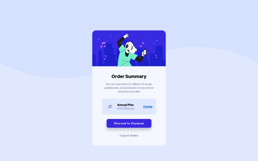
Design comparison
Solution retrospective
Working on this task was quite easier than the rest have worked on, I'm struggling with making the mobile portrait screen responsive and also the mobile desktop screen viewpoint is a bit smaller, I'll have to zoom in to see the content, I really don't know if that's how it should look like but I really love to know what could have gone wrong.
Community feedback
- @correlucasPosted over 2 years ago
👾Hello Busoalmi, congratulations for your new solution!
Answering your question Busoalmi:
To avoid your image losing its proportions while scaling use
display: blockandmax-width: 100%to have the image scaling with the container.hero { display: block; max-width: 100%; object-fit: cover; }Heres a media query to change the pricing section flow vertically":
.plan { display: flex; align-items: center; flex-direction: column; } }👨💻 Here's my solution for this challenge if you wants to see how I build it: https://www.frontendmentor.io/solutions/order-summary-component-vanilla-css-custom-wave-background-hover-tEKUwaT2id
👋 I hope this helps you and happy coding!
0
Please log in to post a comment
Log in with GitHubJoin our Discord community
Join thousands of Frontend Mentor community members taking the challenges, sharing resources, helping each other, and chatting about all things front-end!
Join our Discord
