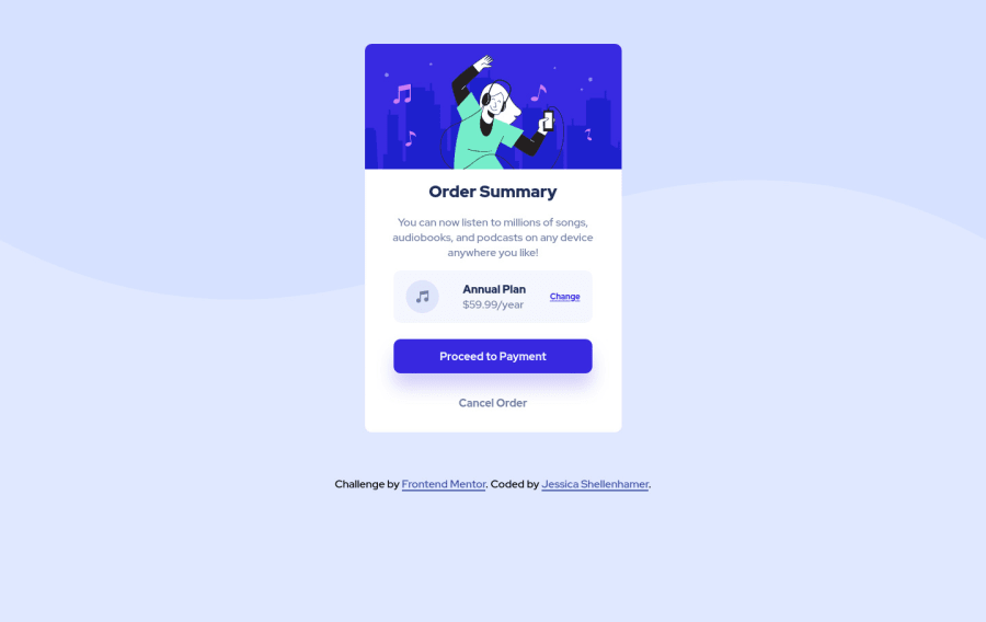
Design comparison
Solution retrospective
Please feel free to leave feedback!!
Thank You
Community feedback
- @techantherePosted about 3 years ago
Hey great work on this solution, and the code looks cleaner as well, well done. I have a few suggestions though, use
aria-hidden="true"wherever you feel alt should be kept empty. Since you are good to go for some advanced challenges, so for links and buttons, I will suggest having a look at this article as buttons and links might be used differently for this solution :)Marked as helpful1P@perezjprz19Posted about 3 years ago@techanthere Thank you! I tried looking at some accessibility articles before I posted my solution, but it feels like a whole different language. I made the update as suggested and I will take a look at the article.
1@techantherePosted about 3 years ago@perezjprz19 it's okay no one is perfect! I myself am still learning, and strongly believe that improvement is a gradual process and this works out for all.
Happy coding :)
0
Please log in to post a comment
Log in with GitHubJoin our Discord community
Join thousands of Frontend Mentor community members taking the challenges, sharing resources, helping each other, and chatting about all things front-end!
Join our Discord
