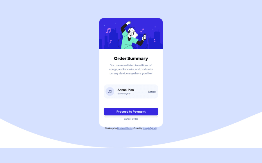
Design comparison
Solution retrospective
I struggled greatly with lining up the content properly. Is there a better way to do so than wrapping everything in divs?
Also the background didn't look 100% right. Was wondering what I did wrong there?
How do I make the shadow match up as well?
Community feedback
- @ereljapcoPosted about 3 years ago
Hello! Just finished doing this, too :)
-
For the background, you're using the background-image for the mobile design on the 1440px design and I think you forgot to add the background-color.
-
You can add blur to the shadow :)
0@JoeSpinPosted about 3 years ago@erelita Thanks! I'm only about 3 months into the learning process and I did everything in a different way so far. After this challenge, I learned I have to go back and focus on CSS some more lol
0@ereljapcoPosted about 3 years ago@JoeSpin It's good to explore different ways :) Yeah. CSS can be confusing sometimes >w<
0 -
Please log in to post a comment
Log in with GitHubJoin our Discord community
Join thousands of Frontend Mentor community members taking the challenges, sharing resources, helping each other, and chatting about all things front-end!
Join our Discord
