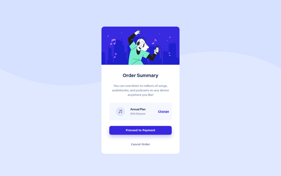
Design comparison
Solution retrospective
Hi! This is my second challenge and I learned CSS grid through Wes Bos's course.
- As far as I can tell, I was able to replicate the UI design well with CSS grid but I'd appreciate it if you could let me know if there's anything I missed.
- I'm not sure whether I overused divs in my HTML code but it seemed like the best way to structure all the different aspects of the card. If there's a way to streamline this more, let me know.
Please feel free to point out anything that needs fixing, I'm still familiarising myself with CSS. Thanks for your help! :)
Community feedback
- @muhammadshajjarPosted over 3 years ago
Well done, I would like to add some points,
As @grace-snow mentioned in her comments that,
-
Proceed and cancel both imply navigation so should probably be anchor tags, not buttons
-
I think you forgot to add active states.
Marked as helpful1@rachanahegdePosted over 3 years ago@muhammadshajjar I have added active states to the links and buttons but I will make sure to change the buttons to anchor tags instead. Thank you for the feedback! :)
0 -
- @aUnicornDevPosted over 3 years ago
The font-family for the links(change, proceed payment and cancel) can be set to "Red Hat Display" to match the design.
Not an overuse of ''DIVS" but some extra "buttons" that could have been just replaced with divs(plan-btn) or a tags(cancel-btn). Semantically speaking, buttons should be signifiers that something can be clicked.
Marked as helpful1@rachanahegdePosted over 3 years ago@aUnicornDev Ohh okay, I forgot to style the links. I'll make sure to update the code.
I'll also replace the buttons with divs or a tags, I had assumed that the design required me to code buttons specifically. Thank you for the feedback!
0 - P@palgrammingPosted over 3 years ago
I would have just attached your main background to the
bodytag. But while you currently have a width on your main background image you should add aheight: 40vhsimilar to this1@rachanahegdePosted over 3 years ago@palgramming Thanks for the feedback, Patrick. I'm a little confused though, why do I need to add a height to the main background image? I thought it was already being displayed correctly without the height explicitly stated.
0
Please log in to post a comment
Log in with GitHubJoin our Discord community
Join thousands of Frontend Mentor community members taking the challenges, sharing resources, helping each other, and chatting about all things front-end!
Join our Discord
