


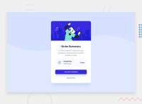
Design comparison


Solution retrospective
What are you most proud of, and what would you do differently next time?
What I'm most proud of from this challenge is developing a better understanding of the CSS background attributes. Creating the wave effect was a real challenge that I originally didn't understand how people could take an image and make a wave effect.
If there is something I could do differently next time is that I still haven't figured out how to make containers be responsive but still have them and their child elements maintain their shape and position inside the parent element and not force the parent element to stretch.
What challenges did you encounter, and how did you overcome them?
The challenges I encountered were as follows. The first challenge was using the CSS background attributes to create a wave effect. I was able to accomplish this by setting the background-repeat attribute to no-repeat and the background-size attribute to reduce the height of the SVG image to 50%.
    background-image: url(./images/pattern-background-mobile.svg);
    background-repeat: no-repeat;
    background-size: 100% 50%;
    background-color: hsl(225, 100%, 94%);
The next challenge I faced was making the image of the person match the size of the container element. However, I decided to make them non-responsive as the image of the person would not be restrained by the container element. So, I set the container element and the image to a set the max-width to 375px.
The final challenge was making the controlling the position of the musical note image, the two paragraph elements and the link element be positioned as such. Using CSS Flexbox, I was able to use the justify-content attribute with the space-evenly value to space them evenly inside the container element. The same with using align-items and centering them. However, to get the two paragraph elements to stack on top of each other, I put them into their own div container so that flexbox would treat them as one block element instead of two separate block elements.
.plan {
    background-color: hsl(225, 100%, 98%);
    display: flex;
    justify-content: space-evenly;
    align-items: center;
    border-radius: 1em;
    margin: 1em;
    div{
        margin-right: 2em;
    }
    .annual {
        font-weight: 700;
        color: hsl(223, 47%, 23%);
    }
    .price {
        color: hsl(224, 23%, 55%)
    }
}
What specific areas of your project would you like help with?
The area I would like help with this challenge would be being able to have a container element control the size of an image so that they both would always be the same size.
I would of also like to know how to make the container and the child elements remain in a fixed position when the screen size is scaling up and down without having to set a hard size.
Community feedback
Please log in to post a comment
Log in with GitHub
Join our Discord community
Join thousands of Frontend Mentor community members taking the challenges, sharing resources, helping each other, and chatting about all things front-end!
Join our Discord