


@correlucas
Posted
👾Hello Fahim Hossain, congratulations for your new solution!
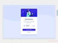
🎨 Here’s some tips to improve your component design:
To make your solution even better and more responsive, you can create a media query to break the elements in the pricing section after width: 350px and make every content in a different row, saving space for low resolution devices.
@media (max-width: 350px) {
.plan-div {
    margin: 15px 0;
    background-color: var(--Very-pale-blue);
    display: flex;
    flex-direction: column;
}
}
The secret to create a perfect and smooth shadow is to have low values for opacity and increase blur try this value instead: box-shadow: 12px 7px 20px 6px rgb(57 75 84 / 8%);
If you’re not familiar to box-shadow you can use this site to create the shadow design and then just drop the code into the CSS: https://html-css-js.com/css/generator/box-shadow/
✌️ I hope this helps you and happy coding!
Marked as helpful
@correlucas
Posted
@Mr-NotSoCreative worked for you?
@Mr-NotSoCreative
Posted
@correlucas I improved the component design according to your CSS Style rule Thank you!! ☺️
@correlucas
Posted
@Mr-NotSoCreative I can see that's fully responsive now! Well done, keep it up and keep posting amazing solutions Fahim.✌
@Mr-NotSoCreative
Posted
@correlucas ✌️


