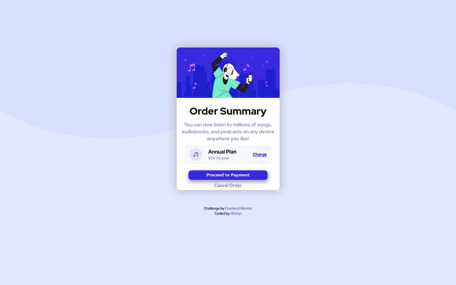
Order Summary Component using CSS custom properties
Design comparison
Solution retrospective
Is there a better way I would have organized this?
Community feedback
- @jasurkurbanovPosted over 2 years ago
First tip
Main problem here is your structure of HTML code. Why you decided to separate image, <main/> and attribution ? It is better to structure like this with HTML5 semantics<body> <main> <section>here goes all content</section> <footer>here goes attribution </footer> </main> </body>Second tip you should remove this image from HTML code
<img src="pattern-background-desktop.svg" alt="background" id="background">because it would be better you do this with CSS. Here is link for demo, on how to can insert image in background using CSS.
Third tip No need to include id for <main> tag since this tag is used once in your webpage. So you can directly refer to in inside CSS like this
main{
....
}
Fourth tip Structure and naming As I showed above you can use HTML5 structure code or you can do in this way as well
Lastly. Your project structure simply can be rewritten in this way.

<body>
    <div class="wrapper">
      <img/>
      <h1>...</h1>
      <p>...</p>
      <div class="currency-info">....</div>
      <div class="author">....</div>
    </div>
</body>
Simple and concise structure with meaningful class names.
1 - @Mire-webPosted over 2 years ago
Thanks @jasurkurbanovinit for the well detailed and elaborate feedback, I will make corrections as stated and will have that in mind for my next challenge, i really appreciate man.
0
Please log in to post a comment
Log in with GitHubJoin our Discord community
Join thousands of Frontend Mentor community members taking the challenges, sharing resources, helping each other, and chatting about all things front-end!
Join our Discord
