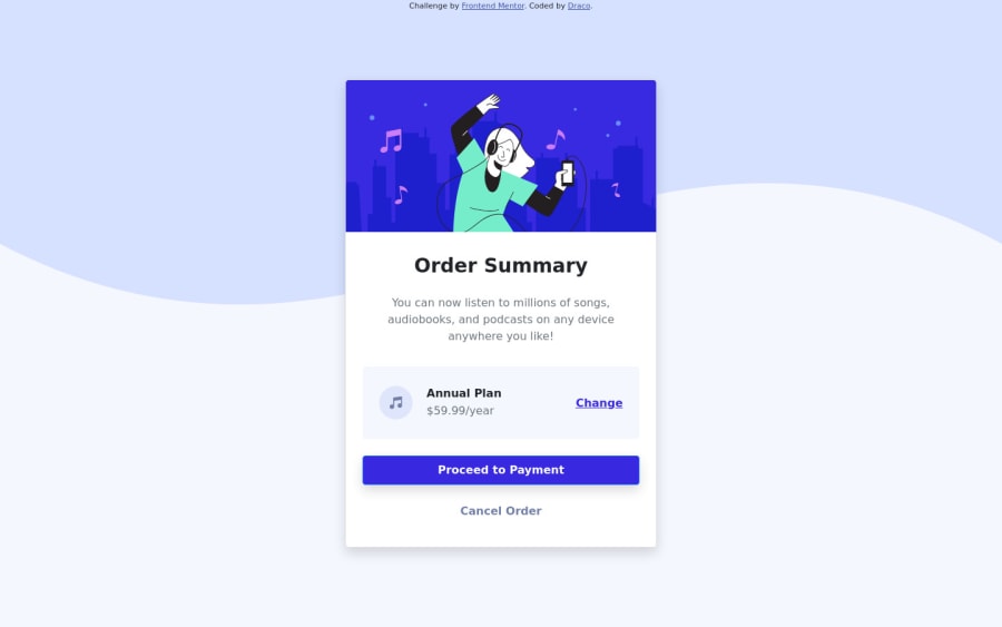
Design comparison
Solution retrospective
I have completed the "Order summary component" challenge by learning and practicing using CSS Framework - Bootstrap and have submitted the solution.
Does anyone have any ideas for learning Bootstrap easier?
Anyone is welcome to check my solution and leave feedback to see whether there are any parts I need to improve this solution.
Community feedback
- @samuelms21Posted about 2 years ago
Hello there! Good job on making this one. My tips on learning Bootstrap is just to keep making websites and layouts, that's how I got used to it. I would browse on dribbble.com and search for landing page designs, and I try to replicate them using Bootstrap.
Here are also some improvements you can make to your project:
- Change your font-family to the specified font family in the style-guide, which is Red Hat Display. You can find this font and import it to your HTML/CSS from Google Fonts. One way to do it, is to copy and paste this following code to the top of your CSS document:
@import url('https://fonts.googleapis.com/css2?family=Red+Hat+Display:wght@500;700;900&display=swap');And since this project uses the same font-family for all components you can do this in CSS to apply the font-family change:
* { font-family: 'Red Hat Display', sans-serif; }- You can add more border-radius on your call-to-action button. You can do this with plain CSS, or you can use Bootstrap by adding the "rounded-{num}" class in your HTML element. Here is the link to the documentation page: https://getbootstrap.com/docs/5.2/utilities/borders/#radius
Marked as helpful1
Please log in to post a comment
Log in with GitHubJoin our Discord community
Join thousands of Frontend Mentor community members taking the challenges, sharing resources, helping each other, and chatting about all things front-end!
Join our Discord
