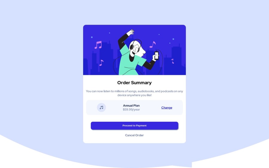
Design comparison
Solution retrospective
Honestly, this one was like most of the CSS challenges. I do need tips on how I could write my CSS better.
I got really stuck on the annual subscription area, not sure how I could've gone about with that.
Community feedback
- @itushPosted over 1 year ago
Congratulations on completing the challenge! š
Your solution looks nice to me :)
In my projects:
- I always start with mobile-first workflow.
- I use at least one main element for a page (entire content goes into the main, if I'm not using header & footer), and avoid divs as much as possible and use section and article element wherever I can.
<body> <main> All content </main> </body>
-
I Use relative units as much as possible and avoid absolute units whenever possible.
-
I remember when I started out, I made countless mistakes and spent long hours searching for solutions. But hey, you don't need to go through the same struggles! š To help you shorten the learning curve, I recommend going through the following articles. They contain valuable insights that can make your journey smoother:
šš 12 important CSS topics where I discuss about css position, z-index, box-model, flexbox, grid, media queries, mobile-first workflow, best practices etc. in a simple way.
šš 11 important HTML topics where I discuss about my thought process and approach to convert a design/mock-up to HTML along with other topics.
I hope you find these resources helpful in your coding adventures! š¤
I'm eagerly looking forward to seeing the amazing projects you'll create in the future! šš»
Keep up the fantastic work and happy hacking! šŖāØ
Marked as helpful0 - @0xabdulkhaliqPosted over 1 year ago
Hello there š. Congratulations on successfully completing the challenge! š
- I have other recommendations regarding your code that I believe will be of great interest to you.
BACKGROUND iMAGE šø:
- Looks like the background svg has not been properly set yet, So let me share my css snippet which helps you to easily apply the
background color
with thebackground svg
they provided to place perfectly as same as design.
- Add the following style rule to your css, and then experience the changes
body { background: url(./images/pattern-background-desktop.svg) no-repeat, #E1E9Ff; background-size: contain; }
- Tip, Don't forget to generate a new screenshot after editing the
css
file
.
I hope you find this helpful š Above all, the solution you submitted is great !
Happy coding!
1 - @amyspencerprojectPosted over 1 year ago
Hi Aviad,
I just finished this challenge and also had a hard time figuring out how to get the Annual subscription elements spaced correctly. I used flex-grow on the middle section so that when the viewport is larger the Annual plan text stays closer to the music icon. There is something funky going on with your background image that I can't figure out. It is almost like it is wrapped around so you see a corner of it below the curve of it mid screen. Are you using some kind of preprocessor for you CSS? That might be causing the issue because your code for the background looks the same as mine. You should maybe ask for help on Discord about it.
Hope this helps. Happy Coding!
1
Please log in to post a comment
Log in with GitHubJoin our Discord community
Join thousands of Frontend Mentor community members taking the challenges, sharing resources, helping each other, and chatting about all things front-end!
Join our Discord