Design comparison
SolutionDesign
Solution retrospective
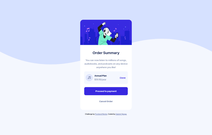
HI I completed this challenge using flexbox layout, it was my first time using SVG graphics, so that was a bit of a learning curve, but I could match the design as close as possible. If you have any suggestions on how better I could have implemented the SVG graphics for the background please leave a comment, All feedback is much appreciated.
Community feedback
Please log in to post a comment
Log in with GitHubJoin our Discord community
Join thousands of Frontend Mentor community members taking the challenges, sharing resources, helping each other, and chatting about all things front-end!
Join our Discord
