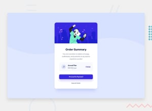
Design comparison
SolutionDesign
Community feedback
- @MamoutyPosted over 2 years ago
Try adding some margin-top to the proceed to payment button and also a box-shadow to it, you may notice it if you look closely to the design reference. Also add some border-radius to the light purple div containing the music icon and price.
1
Please log in to post a comment
Log in with GitHubJoin our Discord community
Join thousands of Frontend Mentor community members taking the challenges, sharing resources, helping each other, and chatting about all things front-end!
Join our Discord
