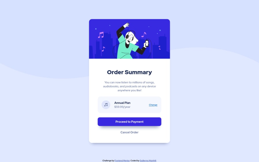
order summary component solution
Design comparison
Solution retrospective
Check this out. There is a better, shorter, more efficient way to do? Thanks in advance.
Community feedback
- @BernardusPHPosted almost 3 years ago
hey GUILLERMO MULVIHILL. I think you might like this approach bc I see that your background img does not reach the end horizontally and its much easier centering. Hope this helps
body { background-color: var(--Pale-blue); background-image: url(images/pattern-background-desktop.svg); background-repeat: no-repeat; background-size:contain; min-height: 100vh; display: flex; justify-content: center; align-items: center; } /* main removed */0@guilleoemPosted almost 3 years ago@BernardusPH But, is not a good practice to have a main landmark?
0@BernardusPHPosted almost 3 years ago@guilleoem Oh sorry I was not specific I meant I did not add any css to the main, I still kept the main element in the html. Sorry again
1@guilleoemPosted almost 3 years ago@BernardusPH Anyway, thanks for remind me the background-size property.
1
Please log in to post a comment
Log in with GitHubJoin our Discord community
Join thousands of Frontend Mentor community members taking the challenges, sharing resources, helping each other, and chatting about all things front-end!
Join our Discord

