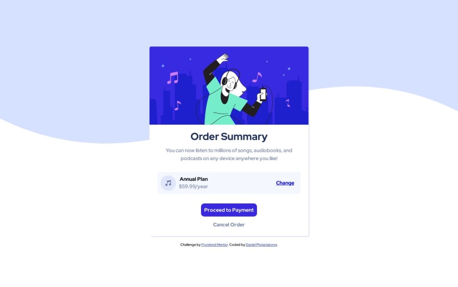
Order summary component solution using HTML and CSS
Design comparison
Solution retrospective
I'm confident about the code is doing what it's supposed to but is it obvious what this code is supposed to be doing? Do the names make sense? Any advice is appreciated.
Community feedback
- @CodeWithAlaminPosted almost 2 years ago
Hi! Congratulations on completing the challenge! I have reviewed your code and overall it looks good, but I noticed a few areas that could be improved. Here are my suggestions:
-
In your CSS file, you are using
position: absoluteandz-index: -1to position the background image behind the text. This is not the best approach as it can cause issues with the layout of your page, especially on smaller screens. Instead, consider using a background property likebackground-imageorbackground-colorto achieve the same effect. -
In some places, you have used an asterisk
*selector to apply default styles to all elements. While this can be useful in some cases, it is generally better to be more specific with your selectors. For example, instead of using* { margin: 0; padding: 0; box-sizing: border-box; }, you could usehtml, body { margin: 0; padding: 0; box-sizing: border-box; }to apply these styles only to thehtmlandbodyelements. -
Finally, I noticed that some of your class names are not very descriptive, like
btn-primaryandbtn-secondary. It's always a good practice to use descriptive class names that clearly indicate the purpose of the element they are applied to. This can make your code easier to understand and maintain in the long run.
I hope these suggestions are helpful to you as you continue to develop your skills. Keep up the good work!
Marked as helpful0 -
Please log in to post a comment
Log in with GitHubJoin our Discord community
Join thousands of Frontend Mentor community members taking the challenges, sharing resources, helping each other, and chatting about all things front-end!
Join our Discord
