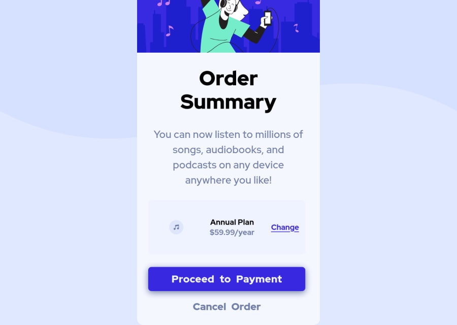
Order summary component Solution #Flexbox #Media-Queries
Design comparison
Solution retrospective
Hi community, i wanna know if this solution is well displayed or if is cut off on the top side when you open it. What things would you change? Please, feel free to leave your suggestion.
Cheers~
Community feedback
- @denieldenPosted almost 3 years ago
Hi Nico, great job but the paper is so big that you can't see it all and it is cut off the screen.
- The
font-sizeis so much big... reduce it at1remfor the body and1.5remfot theh1 - for the internal spaces of the containers of the elements try to use the
paddinginstead of themargin - remove
width: 40%fromcardclass. - remove
marginfrom.card div - You just miss them the effect :hover
Also in the mobile design adding
padding:1 remto the body.I hope that helps ;) Keep it up!
Marked as helpful0 - The
- @LshirocPosted almost 3 years ago
Hi👋, I think you should not change the font-size because they already gave us the appropriate text font-size so we should use that. If you want to change the font-size while screen size changes, then I think you should take a look to fluid typography https://css-tricks.com/simplified-fluid-typography/ https://css-tricks.com/snippets/css/fluid-typography/
Marked as helpful0 - @NaveenGumastePosted almost 3 years ago
Hay ! Good Job
-> Try to set the card height and width so that it fits in center
Keep up the good work!
0
Please log in to post a comment
Log in with GitHubJoin our Discord community
Join thousands of Frontend Mentor community members taking the challenges, sharing resources, helping each other, and chatting about all things front-end!
Join our Discord
