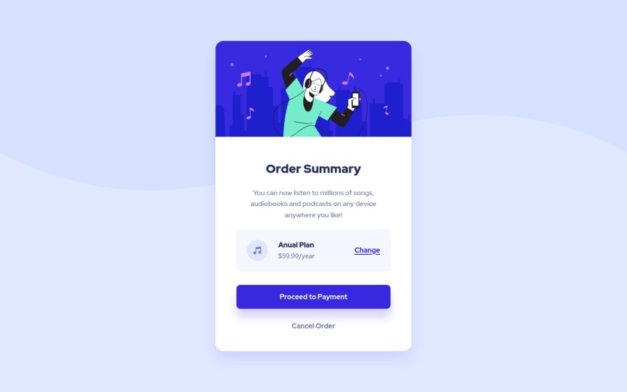
Order summary component // [SASS, CSS-Grid, Vite-js]
Design comparison
Community feedback
- @VCaramesPosted about 2 years ago
Hey @dupakarovsky, some suggestions to improve you code:
-
The “Illustration” and Music Icon serves no other purpose than to be decorative; It adds no value. The Alt Tag should left blank and have an aria-hidden=“true” to hides it from assistive technology.
-
The only heading in this challenge is the ”Order Summary".
-
Your "button" and "Cancel Order" were created with the incorrect element. When the user clicks on the button they should directed to a different part of you site. The Anchor Tag will achieve this.
-
Implement a Mobile First approach 📱 > 🖥
With mobile devices being the predominant way that people view websites/content. It is more crucial than ever to ensure that your website/content looks presentable on all mobile devices. To achieve this, you start building your website/content for smaller screen first and then adjust your content for larger screens.
Happy Coding! 👻🎃
0 -
Please log in to post a comment
Log in with GitHubJoin our Discord community
Join thousands of Frontend Mentor community members taking the challenges, sharing resources, helping each other, and chatting about all things front-end!
Join our Discord
