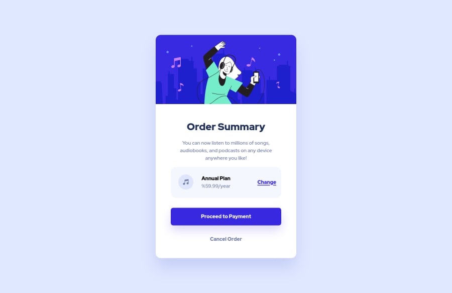
Design comparison
Community feedback
- @HassiaiPosted over 1 year ago
Replace <article class="card-container"> with the main tag and <h3> with <h1> to fix the accessibility issues. click here for more on web-accessibility and semantic html
Every html must have <h1> to make it accessible. Always begin the heading of the html with <h1> tag wrap the sub-heading of <h1> in <h2> tag, wrap the sub-heading of <h2> in <h3> this continues until <h6>, never skip a level of a heading.
You forgot to give the body a background-image with a background-size of contain and a background-repeat of no-repeat.
This challenge requires a media query in the media query you have to change the background-image of the body.
For a responsive content , replace the width in .card-container with max-width and there is no need to give the body a margin value.
Hope am helpful.
Well done for completing this challenge. HAPPY CODING
0
Please log in to post a comment
Log in with GitHubJoin our Discord community
Join thousands of Frontend Mentor community members taking the challenges, sharing resources, helping each other, and chatting about all things front-end!
Join our Discord
