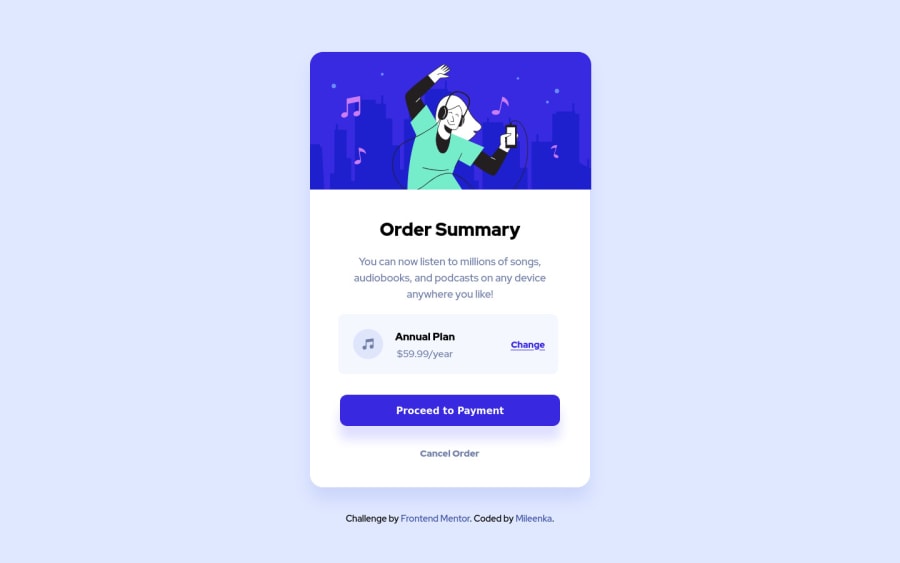
Design comparison
Community feedback
- @correlucasPosted over 2 years ago
👾Hello @Mileenka, Congratulations on completing this challenge!
I’ve few suggestions for you that you can consider adding to your code:
1.Add transitions to make the interaction smoother while the element gets hovered, you can use a value like
transition: all ease-in 0.5s.2.The image is not responsive yet, a quick way to make any image responsive and respecting the container size is to add
display: blockandmax-width: 100%to the<img>selector. To improve the responsiveness even more adding the auto-crop property you can addobject-fit: coverto make the image crop inside the container its inside.img { display: block; object-fit: cover; max-width: 100%; }3.To maintain the card responsive use
max-widthinstead ofwidththis way you allow the content to be flexible. The difference betweenmax-widthandwidthis thatwidthis fixed andmax-widthhas a maximum size but can shrink to fit the content.✌️ I hope this helps you and happy coding!
Marked as helpful1
Please log in to post a comment
Log in with GitHubJoin our Discord community
Join thousands of Frontend Mentor community members taking the challenges, sharing resources, helping each other, and chatting about all things front-end!
Join our Discord
