Not Found
Not Found
Not Found
Not Found
Not Found
Not Found
Not Found
Not Found
Not Found
Not Found
Not Found
Not Found
Not Found
Not Found
Not Found
Not Found
Not Found
Not Found
Not Found
Not Found

Submitted

Order Summary Card

Ari Griggs 270

@nevercanon

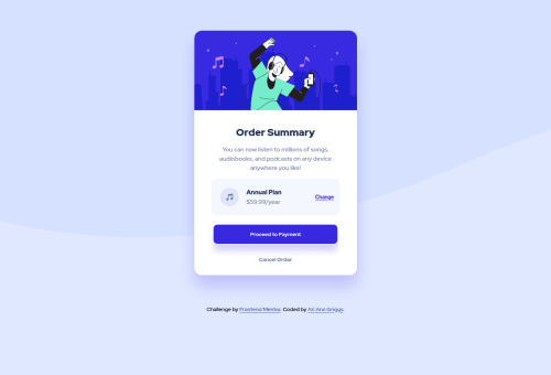
Desktop design screenshot for the Order summary component coding challenge

This is a solution for...

  • HTML
  • CSS
1newbie
View challenge

Design comparison


SolutionDesign

Solution retrospective


How could I have better positioned the background to make it more responsive? Are there any suggestions you have for improving this project?

Community feedback

@catherineisonline

Posted

Looks cool! I would add some transitions for hover states so the color is changing more smoothly. Also, to remove the report issues might need to wrap the div with class attribution in the footer instead of div

Marked as helpful

1
Adriano 37,930

@AdrianoEscarabote

Posted

Hello Ari Griggs, how are you? I truly loved your project's outcome, however I have some advice that I hope you'll find useful:

To align some content in the center of the screen, always prefer to use display: flex; it will make the layout more responsive!

Example:

body {
    margin: 0;
    padding: 0;
    display: flex;
    align-items: center;
    flex-direction: column;
    justify-content: center;
    min-height: 100vh;
}

To improve the code structure wrap this div:

<div class="attribution">

with the semantic tag footer

The remainder is excellent.

I hope it's useful. 👍

Marked as helpful

1

@fermop

Posted

Hi Ari, you did a good job! your page looks so good.

As Hassia said, give the body a background-size of contain. To be honest, I can't understand the differences between contain and cover but remember that fortunately the documentation is in the MDN page. Here's the link if you'd like to chek it out!

I noticed that the card is not centered at higher resolutions and the background is not positioned, to fix these things we can do the following:

body {
/* Positioning the background */
    background-size: 100% 50vmin;

/* Centering the card */
    display: flex;
    flex-direction: column;
    align-items: center;
    justify-content: center;
    min-height: 100vh;
}
.card {
    margin: 0;
}
.attribution {
    margin-top: 3rem;
}

There is an accessibility report due to semantic html elements. Instead of using a div on your footer, try to use the footer element so it'll be easier for a screen reader to see the different parts of the page.

I see that you are using px instead of rem. I highly recommend you to use rem because if the user has the size of their font smaller or larger your page would be the same. Here are two videos that explain it better:

  1. CSS em and rem
  2. Why You Should Use REM Instead of Pixels

If you have any questions feel free to send me a message or answer this comment. I hope it helps!

Marked as helpful

1
Hassia Issah 50,650

@Hassiai

Posted

give the background-size a value of contain instead of cover . Remove the width and height value in the body. Use the colors that were given in the styleguide.md found in the starter folder. Use rem or em as unit for the padding , margin, width and preferably rem for the font-size for more on this watch this https://youtu.be/N5wpD9Ov_To Hope am helpful HAPPY CODING

1

Please log in to post a comment

Log in with GitHub
Discord logo

Join our Discord community

Join thousands of Frontend Mentor community members taking the challenges, sharing resources, helping each other, and chatting about all things front-end!

Join our Discord