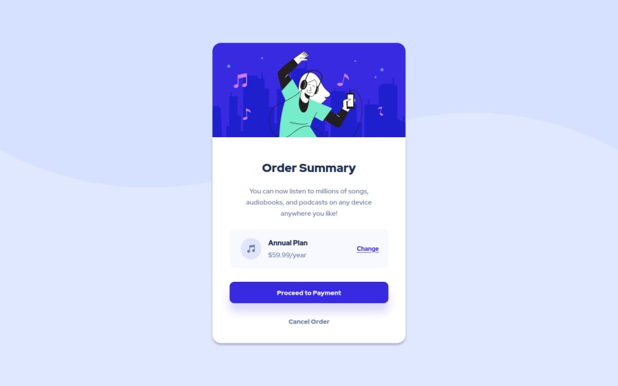
Design comparison
Solution retrospective
Please review the page and let me know your comments and suggestions
Community feedback
- P@FluffyKasPosted about 3 years ago
Hey there, well done, your solution looks very nice! There are only a few small things to correct here:
-
Giving a
background-size: containto thebodywould fix the image so it stretches across the screen nicely. -
min-height: 100vhon thebodyis needed foralign-items: centerto work properly and center your component vertically ^^ -
You need to set a font-family on your button if you don't want it to use the default sans serif.
-
Replacing your container
divwithmainwould be semantically more correct and would get rid of the issue in the report.
1@silkcoderPosted about 3 years ago@FluffyKas Thank you very much for your valuable comments. I corrected the issues you mentioned.
0 -
Please log in to post a comment
Log in with GitHubJoin our Discord community
Join thousands of Frontend Mentor community members taking the challenges, sharing resources, helping each other, and chatting about all things front-end!
Join our Discord
