

Design comparison

Solution retrospective
I have few questions:
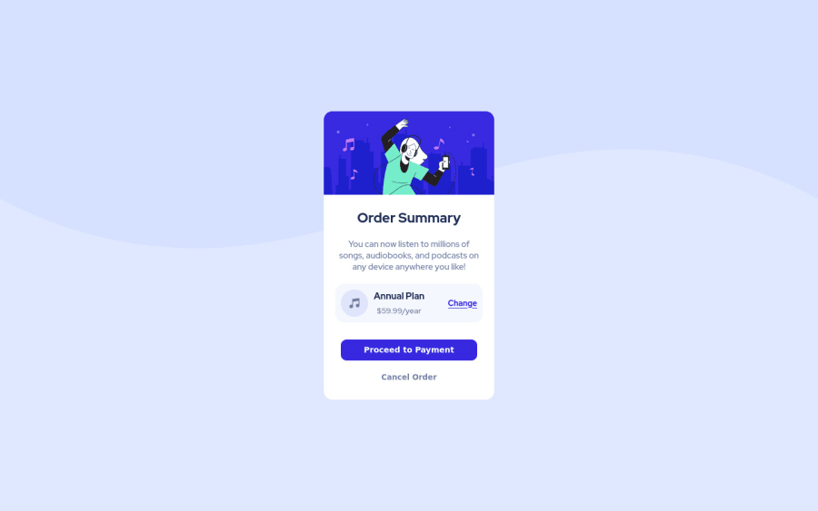
- Are there any other method to make the layout of annual plan and pricing section?
- How can I refractor my CSS to make it short / more readable?
- According to you, what would have been a better way to structure the HTML for this page?
Community feedback
- @DavidMorgadePosted over 2 years ago
Hello Abdullahm congrats on finishing the challenge!
I will try to answer your questions.
1- I think that the path that you took using double flex-box is the best way to do it, you could try to adjust it with some margins and paddings but is better to just use flex to get the desired result.
2- Try using some CSS variables for your colors, so any time you have to use a color you don't need to use the full
hslsyntax, and also, for future apps, you can change the full theme of your webpage just changing 3 or 4 values, instead of all the places where you put colors, if you are not familiar with CSS variables, check-this-out3- I would have change the first
divthat has the whole component inside into amaintag, then the image separated at the bottom with some semantically relatedsection, but this is just a little project, you could also use divs for the inside parts of the card. Would recommend you to use at least oneh1tag, probably 'Order Summary' fits better as anh1.My last advice would be to add some
cursor: pointer;to be clear to the users that this buttons are clickables!Hope my feedback help you! great work!
0@abdullahmd2Posted over 2 years ago@DavidMorgade Thank you so much for answering my questions.
0

Please log in to post a comment
Log in with GitHubJoin our Discord community
Join thousands of Frontend Mentor community members taking the challenges, sharing resources, helping each other, and chatting about all things front-end!
Join our Discord