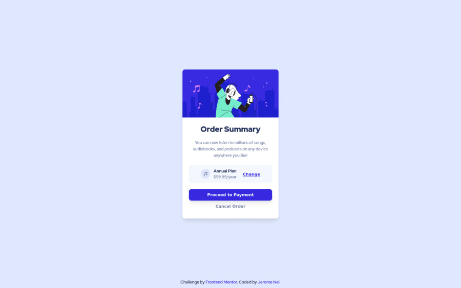
Design comparison
Solution retrospective
Im unsure about the sizes of my containers and fonts size used.
Community feedback
- @Illyaas4ShowPosted over 2 years ago
This is a very nice attempt, Well done! Just some accessibility issues...
Document should have one main landmark- Your page should have one and only one<main>tag to help screen readers navigate the page.You can wrap your '.card' in a main tag.
Hope this helps!
Marked as helpful0 - @correlucasPosted over 2 years ago
👾Hello Nel, congratulations for your solution!
The solution's design is really good, but there are some improvements about the code.
1.To have an idea of the container and elements sizes, you can use Figma to inspect some elements size using the (starter files).
2.You've used a a lot of div, maybe you can clean your code deleting some, for example, the h1 and p don't need separate div, the pricing section yes, but for the section with the card info you wrap all information within 2 div.
3.You don't need to use
overflow: hidden;to manage the image borders, is better you just set the top / left margin with the same border-radius used in the container.4.There's no need for media query in this challenge, you can work with container responsiveness and let it contract under a smaller screen and thats it.
Hope it helps, and congrats for this new challenge!
Marked as helpful0@nelpopuliPosted over 2 years ago@correlucas Hi Lucas, thanks again for the tips, for the num1 tips you gave, sadly I don't have access on figma assets since I didn't subscribe yet as a PRO member.
1
Please log in to post a comment
Log in with GitHubJoin our Discord community
Join thousands of Frontend Mentor community members taking the challenges, sharing resources, helping each other, and chatting about all things front-end!
Join our Discord
