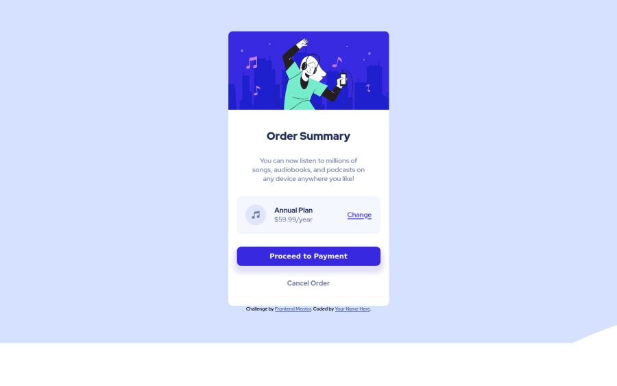
Design comparison
Solution retrospective
HTML and CSS basic. Hope you can give me some advice to improve
Community feedback
- @AshxaryaPosted over 2 years ago
Hi! 😊
I have some feedback to help you out.
HTML 📄:
Use the <footer> tag to wrap the footer of the page instead of the <div class="attribution">. The <footer> element contains information about the author of the page, the copyright, and other legal information.
As you can see in your accessibility report, you are recommended to use a level-one heading as in h1 instead of header.H1 tags improve user experience in the sense that they're part of a web page's hierarchical structure.
CSS 🎨: For ease of access in future projects, you can create variables of different colors at the beginning of your sheet. You can read more here to learn about this here
You seem to have also used the mobile background image instead of the desktop background image which may be the reason why it seems off.
On the topic of mobile, the given style guide suggests using a mobile width of 375px, although you do not have to follow the guide to a T this will help make the website responsive for smaller devices.
You may want to also use rem instead of pixels for font-sizes! You can learn more about this topic here
Have a great day/night ^^
Marked as helpful0@tetinhxuanPosted over 2 years ago@Ashxarya thank you a lot, your advice's so helpful to me.
0
Please log in to post a comment
Log in with GitHubJoin our Discord community
Join thousands of Frontend Mentor community members taking the challenges, sharing resources, helping each other, and chatting about all things front-end!
Join our Discord
