

Design comparison

Solution retrospective
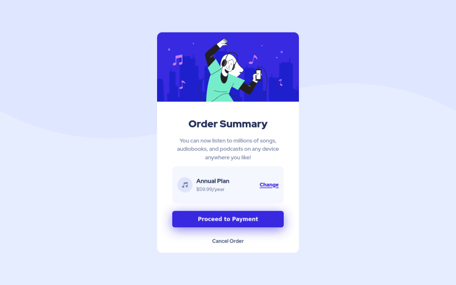
No responsivity, optimized for large screens only. Focused mainly on SASS preprocessor :)
Community feedback
- @visualdennissPosted over 1 year ago
Hey there Jan,
nice work, but there seems to be few issues on desktop view.
It seems you have used: height: 75vh; but this is causing the container to fall short off its content. I'd suggest avoid giving fixed height or max-heights for elements/containers that contain text elements. Not only it might breakout your layout like in this case, but it will cause accessibility issue, when user changes their default font-size, text will overflow and break the layout, instead use paddings inside the container if necessary. It is better to use min-height etc. but never a fixed height. Also i'd recommend having min-height: 100vh for the body instead of height: 100vh.
Hope you find this feedback helpful!
Marked as helpful0@jkop22Posted over 1 year ago@visualdenniss Thanks! I updated my solution and its much better now :)
1@visualdennissPosted over 1 year ago@jkop22 Hey, happy to be helpful! Yes it is looking much better now! :)
i'd also suggest adding some margin on top and bottom of the card or padding to the body so the card does not touch the edges, which is the case for me on notebook.
0

Please log in to post a comment
Log in with GitHubJoin our Discord community
Join thousands of Frontend Mentor community members taking the challenges, sharing resources, helping each other, and chatting about all things front-end!
Join our Discord