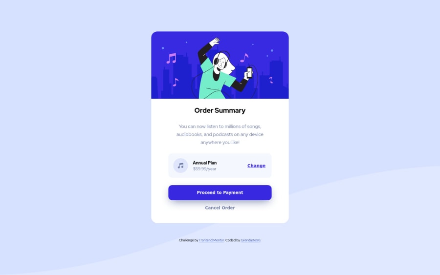
Design comparison
SolutionDesign
Solution retrospective
Still have a problem with responsive behavior, maybe you could tell me about bad practices in my code, and about best pratices i should use.
Thanks in advance!!!
Community feedback
- @rostyslav-nazarenkoPosted about 2 years ago
Hi!
Everything looks great! Only a few suggestions.
- use resets for
buttonas it doesn't inheritfontproperties from parent elements. - provide a more descriptive
altattribute for the image or leave it empty - use relative units in media queries, preferably
emunits. The same goes for componentmax-width - don't use
strongfor styling, use CSS.
1 - use resets for
- @AlexKolykhalovPosted about 2 years ago
Looks good, and the markup is also норм)
1
Please log in to post a comment
Log in with GitHubJoin our Discord community
Join thousands of Frontend Mentor community members taking the challenges, sharing resources, helping each other, and chatting about all things front-end!
Join our Discord
