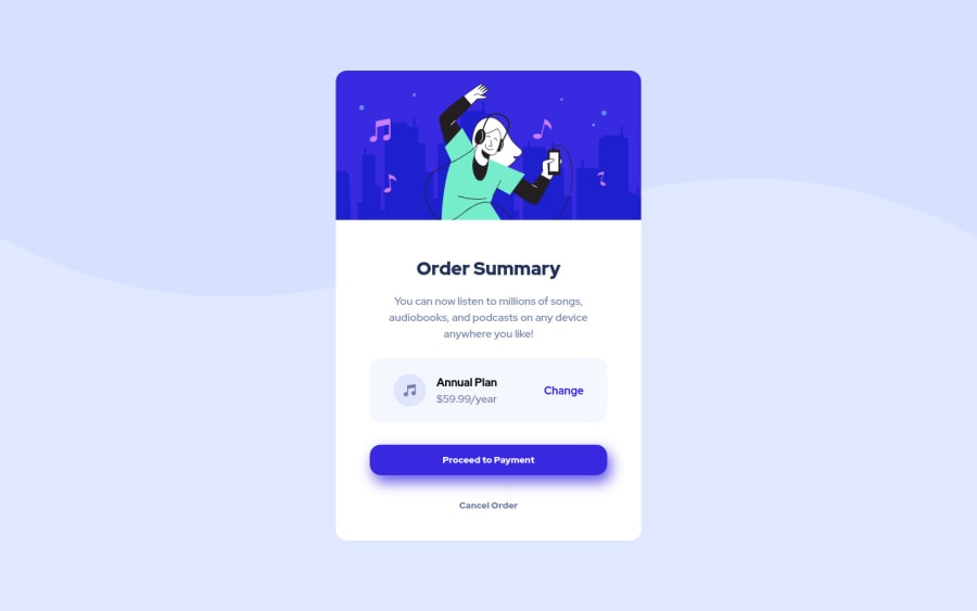
Design comparison
Solution retrospective
Hey guys 👋
I've just finished this challenge and I need your feedback, especially about my semantics of HTML. What do you think of my <section> usage?
Community feedback
- @HassiaiPosted over 1 year ago
Replace <h4> with <h2> to fix the accessibility issue. Always begin the heading of the html with <h1> tag because the <h1> is needed to make the content accessible, wrap the sub-heading of <h1> in <h2> tag, wrap the sub-heading of <h2> in <h3> this continues until <h6>, never skip a level of a heading.
Add the alt attribute
alt=" "to the img tag and give it a value to fix the error issue. The value of the alt attribute is the description of the image. For decorative images like icons, there is no need to give it an alt value, for more on alt attribute Click here.Use relative units like rem or em as unit for the padding, margin, width values and preferably rem for the font-size values, instead of using px which is an absolute unit. For more on CSS units Click here
There is no need to give .main-container min-width and max-width rather replace the width with max-width, for a responsive content.
Hope am helpful.
Well done for completing this challenge. HAPPY CODING
1
Please log in to post a comment
Log in with GitHubJoin our Discord community
Join thousands of Frontend Mentor community members taking the challenges, sharing resources, helping each other, and chatting about all things front-end!
Join our Discord
