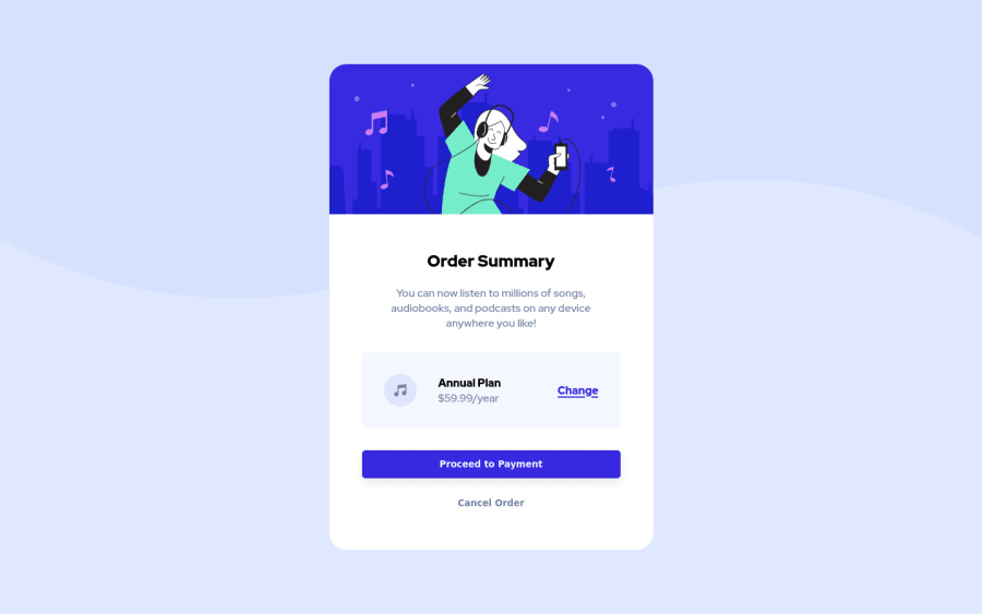
Design comparison
SolutionDesign
Community feedback
- @markteekmanPosted about 3 years ago
Hey Hidde,
Nice solution! It's really close to the original design :) Be sure to also check Frontend Mentors report, it contains really helpful information about accessibility and semantic HTML! In this case, adding an empty
alt=""tag to your image and wrapping your content in a<main>landmark should do the trick.Keep it up!
Marked as helpful0
Please log in to post a comment
Log in with GitHubJoin our Discord community
Join thousands of Frontend Mentor community members taking the challenges, sharing resources, helping each other, and chatting about all things front-end!
Join our Discord
