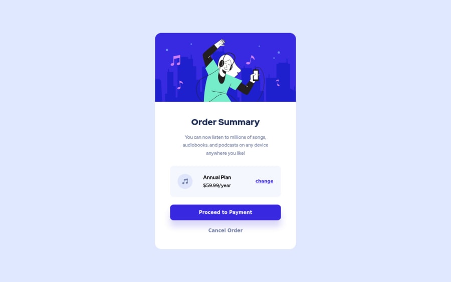
Order Summary Component Main with HTML and CSS
Design comparison
Solution retrospective
I particularly don't know how to improve this project even more, my biggest doubt is regarding the git-hub, there I use a gif for the best experience, but I don't know where I should put the .gif file Should I host the file? But I couldn't find a good free place to host big gifs without losing quality I see that some sizes I can't reproduce like the photo, there is a tool for those of us who don't have the pro to know the exact spacing size of each element
Community feedback
- @hardy333Posted about 3 years ago
Hey, nice solution, card looks very good and it is responsive as well. GOOD JOB.
One suggestion:
- For me hover effects on button and links looks little to intensive, personally i would make them little bit less notable.
Also not sure why do you need javascript in html and why you nested it on other div elements...
Marked as helpful4@MarlonPassos-gitPosted about 3 years ago@hardy333 Thank you for taking the time to give feedback, The script part was actually a text of mine, but I ended up forgetting when sending the project, this has already been fixed.
Regarding the focus states, would you have any suggestions or examples of how to apply them? Add some animation, increase or decrease the element's size more, make it faster. Really that, I get a little lost
Thanks again for the feedback :)
0 - @Shahab-MalikkPosted about 3 years ago
Hey, implemented everything well. But I noticed a problem in "Change" inside plan box when we hover it looks strange. Also instead of
.card .plan__button { text-decoration: underline; }
you can just use an anchor tag for that by which you don't have to use text-decoration property.Marked as helpful1@MarlonPassos-gitPosted about 3 years ago@shahabmalik996 Thank you for taking the time to give feedback, I put the button tag on everything because in my head I was thinking that it was a button of a component that would be separated and show other types of plans without changing the screen.
Do you have any suggestions on how I could make the hover effect on the cartoon more interesting?
Thanks again for the feedback :)
0@Shahab-MalikkPosted about 3 years ago@MarlonPassos-git Brother you can use hover effect on header by using 1 Transform property(in this case you can use Scale property) 2 by setting opacity of image and then you can change it on hover -Transform Property -
.card__image { object-fit: cover; transform: scale(1.5); transition: all .5s; }
-`.card__image:hover {transform: scale(1);
}
-Transform Property -
.card__image { object-fit: cover; opacity: scale(.7); transition: all .5s; }-
.card__image:hover {transform: opacity(1);
}` i think you will understand this you can add cool effects as much as you can.
Marked as helpful1 - @FluffyKasPosted about 3 years ago
Hey, it looks good but there's always a few things to improve :)
-
Your buttons use the browser's default font-family. You either set them specifically or use
all: unset
for getting rid of browser defaults. -
I see in your readme that your background works well, however when I check the live site I don't see it at all.
-
I see you have a few HTML issues in the report, perhaps it's worth taking a look at them!
Marked as helpful1@MarlonPassos-gitPosted about 3 years ago@FluffyKas Thank you for taking the time to give feedback, fix the report issues and manage to add the source to the buttons (previously I had to add the source to all elements that are inside <main>, but it didn't work anyway). I just didn't understand your second point, because for me I can view the site calmly, if you could show me what it's looking like for you, I would try to solve it.
Thanks again for the feedback :)
0@FluffyKasPosted about 3 years ago@MarlonPassos-git I'm honestly not sure what might be the problem but I'll send a screenshot on Slack ^_^
1 -
Please log in to post a comment
Log in with GitHubJoin our Discord community
Join thousands of Frontend Mentor community members taking the challenges, sharing resources, helping each other, and chatting about all things front-end!
Join our Discord