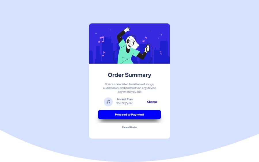
Design comparison
SolutionDesign
Community feedback
- @DarionasPosted over 1 year ago
Hey, JakMiro!👋
Congratulation on completing this challenge. 🎉
Here are some suggestions:
- Page is not fully responsive. If you open Web developer tools on browser and check on 280 x 650 device size you will see that your page is out of screen.
- It will be good practice to have Readme.md file. It will be good introduction to your repository. How to use Markdown, which tools to use: online editor or regular code editor.
- Instead div's use semantic elements for accessibility (header, nav, main, aside, section, footer), because of people diversity. Disable people will be able to use your page.
- On page must be at least one h1 heading. Sometimes it makes sense to add content just for screen readers (hide heading). This is such a case. A common practice is to use a CSS class .sr-only, where sr means screen reader. For that heading set class 'sr-only', and on CSS file hide it. It is a matter of accessibility.
- If you add a decorative SVG image with the <img> element, you must add an empty alt attribute (on icon-music.svg image).
I hope this helps. Happy coding! 👍
0
Please log in to post a comment
Log in with GitHubJoin our Discord community
Join thousands of Frontend Mentor community members taking the challenges, sharing resources, helping each other, and chatting about all things front-end!
Join our Discord
