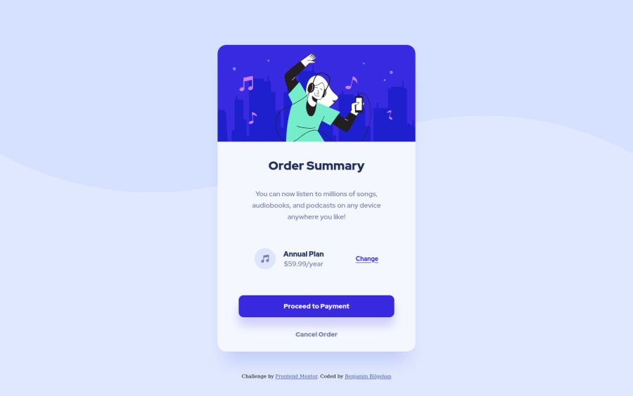
Design comparison
Community feedback
- P@visualdennissPosted about 2 years ago
Nice work Benjamin!
Your card container seems very close to the design.
Few suggestions though:
-
I've noticed you have used fixed heights in many places. Try to use only min-height when necessary, but most of the time you don't need any height. Height should be decided by the content of the container, if needed simply tweak it with paddings and margins of the contents. Fixed heights are known to cause various issues, resulting in overflowing content when data or font-sizes change.
-
Add a cursor: pointer; to the button and link elements, it is an important indicator of interactivity, combined with a color/bg-color change on hover. It improves UX.
Hope you find this feedback helpful!
0 -
Please log in to post a comment
Log in with GitHubJoin our Discord community
Join thousands of Frontend Mentor community members taking the challenges, sharing resources, helping each other, and chatting about all things front-end!
Join our Discord
