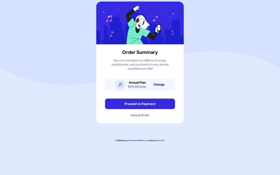
Design comparison
SolutionDesign
Solution retrospective
This was a bit tricky but I eventually got it done. Let me know if there was anything I missed or could improve. I'm just starting with incorporating media queries and making my pages responsive so any advice will be appreciated :x
Community feedback
- @danielmrz-devPosted 9 months ago
Hello @0x-UG!
Your solution looks very good!
Here's how you can fix the background to make it looks like the design:
body {
    background-image: url(images/pattern-background-desktop.svg);
    background-repeat: no-repeat;
    background-size: contain;
    background-color: #E1E9FF;
}
I hope it helps!
Other than that, great job!
0
Please log in to post a comment
Log in with GitHubJoin our Discord community
Join thousands of Frontend Mentor community members taking the challenges, sharing resources, helping each other, and chatting about all things front-end!
Join our Discord
