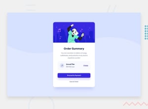
Design comparison
SolutionDesign
Solution retrospective
Hello Frontend Mentor Community!
Here is my solution to the Order Summary Component Challenge.
If any, are there any ways I can improve on my approach to this challenge.
Community feedback
- @vanzasetiaPosted almost 2 years ago
Hi, Trung!
Here are some suggestions for improvements.
- The "Cancel Order" should be an interactive element. It can be either
<a>or<button>. Your choice depends on what you think will happen after the users click the button. - The same goes for the "Change". It should be wrapped by an interactive element.
- For your information, anchor tags are for navigation. The
<button>elements are for actions like opening a modal, submitting a form, toggling element, etc. It is essential to use the correct elements. - Not every image needs alternative text. Decorative images should not have alternative text (
alt=""). This will tell the screen reader to skip over the image. As a result, it saves screen reader users time navigating the page. - For your information, decorative images are images that don't add any information and serve only aesthetic purposes. In this case, the hero image and the music icon are decorative images.
- Don't change the
<html>or the:rootfont size. It can cause huge accessibility implications for those users with different font sizes or zoom requirements. - If the default font size is
16pxthen there is no need to specify it. It is already the browser's default styling (the same asfont-size: 1remorfont-size: 100%).
I hope my feedback helps.
Marked as helpful1@trunglam7Posted almost 2 years ago@vanzasetia Thank you for this feedback! It is very informative and helpful.
0 - The "Cancel Order" should be an interactive element. It can be either
Please log in to post a comment
Log in with GitHubJoin our Discord community
Join thousands of Frontend Mentor community members taking the challenges, sharing resources, helping each other, and chatting about all things front-end!
Join our Discord
