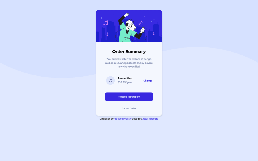
Design comparison
Solution retrospective
In this project I tried to improve my code, making it more readable and more order. Also, I used the feedback of my previous project to give a better accesibility to my project.
Any feedback is welcome, I'm still learning, and I like to receive advices.
Community feedback
- @MiculinoPosted almost 3 years ago
Hey @Rebeitte, congrats on completing the challenge!
Overall, your solution looks really good and the responsive design works as expected.
Just a few suggestions based on your final solution that I hope will be useful to you:
-
Add a
background-colorfor the.planselement - refer to the original design for the color -
On larger screen sizes, make the "Proceed to Payment" button a bit wider
-
Increase the y offset of the
box-shadowof the card and increase the blur as well. Perhaps the color is different as well from the looks of it
Marked as helpful1@RebeittePosted almost 3 years ago@Remus432 Thank you a lot! haha it was my first time using shadows, I´m not the best working with that.
Thank you so much for your feedback!
1@MiculinoPosted almost 3 years ago@Rebeitte happy to help!
And don't worry, with time and practice, all of this stuff will feel become second nature ;)
1 -
Please log in to post a comment
Log in with GitHubJoin our Discord community
Join thousands of Frontend Mentor community members taking the challenges, sharing resources, helping each other, and chatting about all things front-end!
Join our Discord
