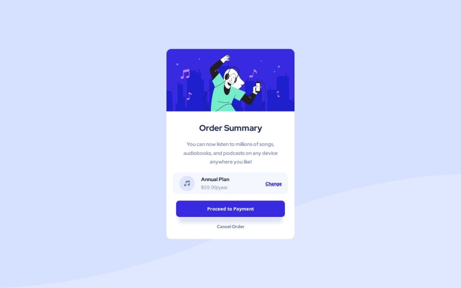
Design comparison
Solution retrospective
Next time I'm probably going to try to utilize CSS grid instead of Flexbox for the annual plan section.
What specific areas of your project would you like help with?I'll admit I probably didn't spend enough time on it but the background image isn't accurate and if I fiddled around with it I could figure it out so if anybody could tell me what the obvious solution to this is then it would be much appreciated.
Community feedback
- @chuckstervPosted 7 months ago
Hey there. Congratulations on your submission.
Using
background-size: contain;instead ofbackground-size: cover;will help you align more with the design.Cheers.
Marked as helpful1
Please log in to post a comment
Log in with GitHubJoin our Discord community
Join thousands of Frontend Mentor community members taking the challenges, sharing resources, helping each other, and chatting about all things front-end!
Join our Discord
