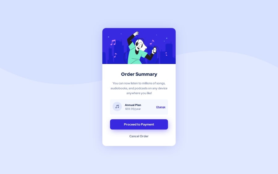
Design comparison
SolutionDesign
Solution retrospective
I faced some problems while coding the responsive design for this layout but in the end, I figured something out. I would be grateful for your feedback and improve my code. Thank you!
Community feedback
- @fernandolapazPosted over 1 year ago
Hi π, just a couple of things that may interest you:
HTML / ACCESSIBILITY:
- It is good not to skip heading levels (start with
<h1>
, then<h2>
, and so on).
- These are decorative images and therefore need an empty
alt
attribute to be ignored by a screen reader.
I hope itβs useful : )
Nice solution.
Regards,
Marked as helpful1@IamAbhiDevPosted over 1 year ago@fernandolapaz Thanks for your feedback! I'll make sure to do so in order to make the webpage more accessible.
1 - It is good not to skip heading levels (start with
Please log in to post a comment
Log in with GitHubJoin our Discord community
Join thousands of Frontend Mentor community members taking the challenges, sharing resources, helping each other, and chatting about all things front-end!
Join our Discord