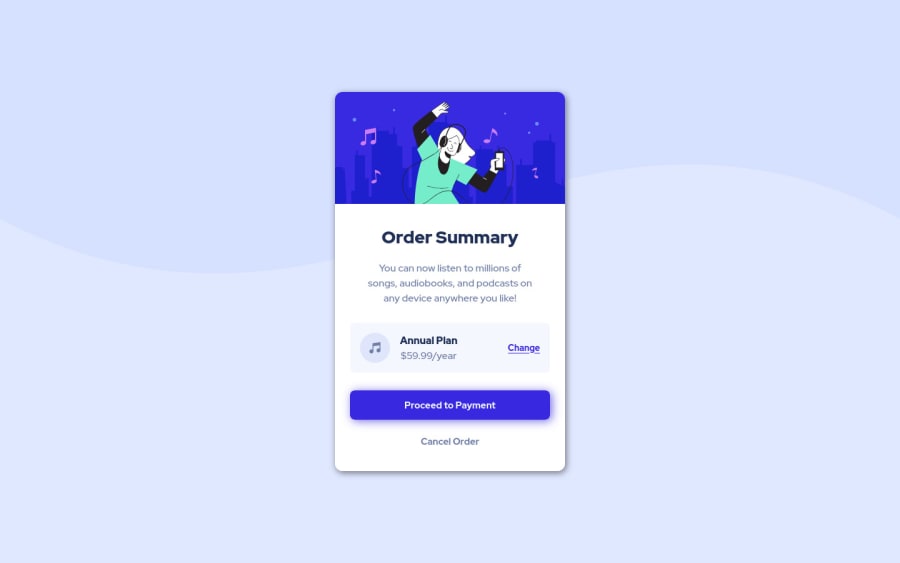
Design comparison
SolutionDesign
Solution retrospective
- This is the first time I used scss, so any feedback about the code is appreciated.
- What are the best practices while splitting a scss file ?
Community feedback
- @vanzasetiaPosted about 2 years ago
Hi, Krutagna! 👋
Congratulations on finishing this challenge! 👏
It's great that you don't do a lot of nesting when using Sass. Good job! 👍
I recommend reading "5 Handy Sass Code Snippets" article. In that article, you will find some useful
@mixin
to help you write Sass.Some more suggestions from me.
- The illustration is a decorative image. So, leave the alternative empty (
alt=""
). This way, screen reader users won't have to listen to decorative elements. The same goes for the music icon. figure
element doesn't need to wrap theimg
element. The only reason to usefigure
is if you need to include afigcaption
. Otherwiseimg
tag is fine.- Always specify the
type
of thebutton
. In this case, set the type of them astype="button"
. It will prevent the button from behaving unexpectedly. - Use the
em
unit for media queries. It adapts when the users change their font size setting. Here are some references.
That's it! I hope this helps!
1@vanzasetiaPosted about 2 years ago@krutagna10
You are welcome!
There's no need to submit a new solution. Just update the code with the latest changes with Git (
git push
). This is what Git is used for.0 - The illustration is a decorative image. So, leave the alternative empty (
Please log in to post a comment
Log in with GitHubJoin our Discord community
Join thousands of Frontend Mentor community members taking the challenges, sharing resources, helping each other, and chatting about all things front-end!
Join our Discord