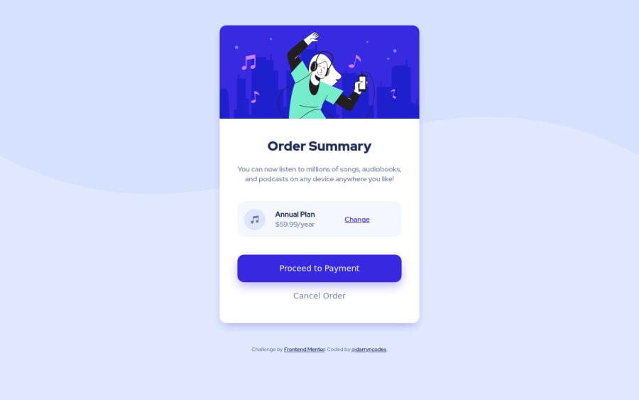
Order summary component - HTML, SCSS, FlexBox & Grid
Design comparison
Solution retrospective
Hi everyone 👋
Another really enjoyable one to code up. I definitely feel like i'm speeding up and have carved out a decent little workflow.
Any thoughts welcome!
Happy coding 🤙
Community feedback
- @mattstuddertPosted over 3 years ago
Awesome work on this challenge, Darryn! You mentioned your workflow and how you're speeding up and getting more comfortable, which is awesome.
Have you ever tried using
min-width
media queries instead ofmax-width
? It's quite a common workflow with front-end developers to use them and work mobile-first. It can often lead to less CSS code and benefits from loading in fewer styles for mobile users, which can be a nice performance gain.It might be worth trying on a future project to see how you get on. There's a chance it might slow you down in the short term, but I generally find it easier and faster vs working desktop-first.
Here's a great article I recently read about mobile-first and desktop-first workflows, which you might find useful.
Keep up the great work! 👍
Marked as helpful3@darryncodesPosted over 3 years agoHi @mattstuddert, thanks for taking the time to comment and I'm glad you like the solution!
I've never worked with
min-width
, I've been mulling it over for some time now but the idea has always been met with slight trepidation (I'm not sure why haha).Your comment is really timely and given me the courage to go for it. I've got one project lined up but the next one I'm going to tackle it. The positive's seem to out weigh the negatives.
Great article too, thanks a lot 🤙
1@mattstuddertPosted over 3 years ago@darryncodes, yeah, there are a lot of positives to working mobile-first. I look forward to hearing how you get on when you build your first mobile-first solution!
2 - P@DarrickFauvelPosted almost 3 years ago
Hey Darryn, nice work! I noticed that the background image does not display at screen widths <= 650px. There is a
pattern-background-mobile.svg
file that can be used for small screen sizes. Make it your default background image for small screens and use amin-width
media query to change to thepattern-background-desktop.svg
for larger screens.Hope this helps.
:Darrick
0
Please log in to post a comment
Log in with GitHubJoin our Discord community
Join thousands of Frontend Mentor community members taking the challenges, sharing resources, helping each other, and chatting about all things front-end!
Join our Discord