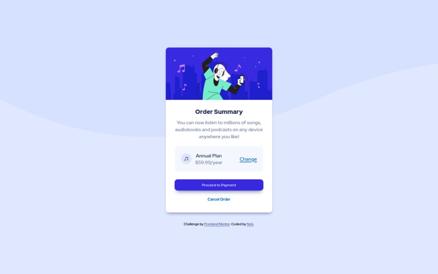
Design comparison
Solution retrospective
Hi all, I was pretty pleased with how this one went with just two issues.
1 - Can someone please take a look at how I resolved the background image? I found it a real pain tbh and not sure I've put it together in the best way possible.
2 - This may be the stupidest question today but I can't for love nor money make the "Annual Plan" text bold without affecting the price at the same time. I gave it a custom class and set the font-weight to 700 etc, but that didn't work. I'm guessing it is something to do with inheritance perhaps? I tried all manor of declearing the parent classes in my CSS but still couldn't get it to change.
Any feedback is much appriciated.
Community feedback
Please log in to post a comment
Log in with GitHubJoin our Discord community
Join thousands of Frontend Mentor community members taking the challenges, sharing resources, helping each other, and chatting about all things front-end!
Join our Discord
