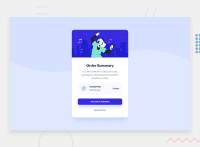
Design comparison
SolutionDesign
Solution retrospective
Hello All,
Please review my solution! Any feedback is welcome :)
Community feedback
- @grace-snowPosted over 2 years ago
Hi
There are a few things that need fixing on this.
- content is overflowing for me on mobile. I think this is because of the margins within the card-plan grey box making everything too wide. This margin is also what's causing the annual plan writing to stack:
.card-price-plan { margin-right: 3.125rem; // change to margin auto // add text align left here }- the card needs a little margin on it or padding on a wrapping element so it can't touch screen edges
- change the height 100vh to min-height. This is what's causing the image to be cut off completely for me on mobile landscape at the moment
- on the subject of height, the card should never have one. Let it be as tall as it needs to be based off its content. If I change text size or zoom the card needs to be able to grow. Remove that height, and then it will.
- font size must never be in px. Use rem
- line height should never be in px, it should be unitless like 1.4 or %
- your desktop media query is starting to early. This means most mobile users will be served desktop images and styles. Make it at least 700px (or that in rem)
- curious why you're using buttons for all 3 actions. Might be fine, might not. What would you expect to happen on click of each of these 1) change 2) proceed 3) cancel. If you say what you'd think would happen that will define what element to use
- don't forget to always include focus-visible styles to interactive elements. It needs to be clear and obvious (no designs provided for this) so keyboard users know exactly where they are on the page.
Marked as helpful2@riverCodesPosted over 2 years ago@grace-snow I completed this challenge too as well recently and your comment helps me a lot too!
1 - @Mohammedabbas7Posted over 2 years ago
Hello, nice work by the way. just you have a little problem with your background-image URL, you typed the URL wrong.
you need to be like this
.card-image { background-color: url(../images/illustration-hero.svg; }.Keep up the good work :)
Marked as helpful1 - @Kamasah-DicksonPosted over 2 years ago
Your solution looks great besides good job👍
1
Please log in to post a comment
Log in with GitHubJoin our Discord community
Join thousands of Frontend Mentor community members taking the challenges, sharing resources, helping each other, and chatting about all things front-end!
Join our Discord

