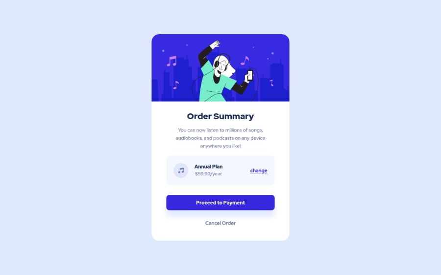
Order summary component (HTML | CSS)
Design comparison
Solution retrospective
This challenge proved to me again that using rem is really helpful more than using px unit.
Any Feedback?!😊
Community feedback
- @grizhlieCodesPosted over 3 years ago
Howdy, great job for this solution.
Overall, I don't have much to add, very clean and concise code that shows strong understanding of a lot of core css.
I did notice you added a
height: 13.75remto your image, there is no need. Also themax-height: 100%doesn't do anything. I'm pretty sure this is because the image was built for this width, so when it spreads towidth: 100%the aspect ratio that calculates the height of the image is already at that13.75rem. This probably means thatobject-fitwon't do much here either since the image already fits perfectly to that width.Oh yeah, I saw rather strange amounts of margins of
0.9375remso I can only assume you haven't come across this glorious method::root { font-size: 62.5%; }Now if you type
1.5remit will equal to15px.1rem = 10px, 0.1rem = 1pxand so on. This is easier to work with, not sure if there's a benefit to doing all that 'math', lets let the browser handle all that work instead!The logic is simple:
100/16*10 = 62.5. We basically want to calculate the % of a rem unit that we need in order to get1rem = 10pxand this is what it all does.So now you can crack on and write
margin: 1.5rem😁Perhaps a hover-effect for the main button would be nice (
payment-button)? Even changingopacity: 0.7or something as it's usually quickest to implement.Ah, I had a look at your button afterwards and I noticed that you have:
<button>
    <a href>Proceed to Payment</a>
</button>
Generally speaking you either want a link or a button. Having both makes little sense and might mess up the semantics a bit. An anchor can be styled like a button. An anchor can be given Javascript functionality that allows it to pass data to somewhere else whilst using the link.
Oh ya - this is actually 'wrong' html I think. I made this mistake a week ago so it's still fresh:
The interactive element [a] must not appear as a descendant of the button element.linkHope this was somewhat useful!
Marked as helpful2@Rezzak48Posted over 3 years ago@grizhlieCodes HI, I tried today the idea that u gave me, I did a challenge with it and it was really helpful, just want to ask you again for it
1@grizhlieCodesPosted over 3 years ago@errazakallah31 Amazing 😁, glad it worked out. I'll have a look at your solution a bit later on!
1 - @Rezzak48Posted over 3 years ago
Hi buddy, thanks for your time! for the unit rem, generally I used auto convert extension, but it causes a problem whenever I want to check sth, bcz I have to convert back to px to understand it. The solution that u gave is absolutely genius one, I really apperciate it man! for the other two issues, I fixed them. Thank you. I really didn't pay attention to the image height, normally 100% is enough as u said! Thank you man for this tip, it is really helpful
1
Please log in to post a comment
Log in with GitHubJoin our Discord community
Join thousands of Frontend Mentor community members taking the challenges, sharing resources, helping each other, and chatting about all things front-end!
Join our Discord
