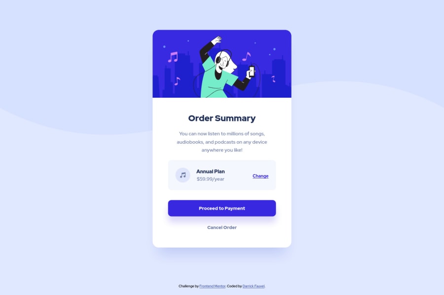
Order summary component - HTML, CSS, & Parcel
Design comparison
Solution retrospective
Hi All,
I refactored this project with Sass and used Parcel.
I would appreciate any feedback you have. Did I miss anything? Could I do something do better?
Thanks :D
Community feedback
- @AdrianX19Posted about 3 years ago
Hi @DarrickFauvel
really good job, well done! I would just try to make the sizes a bit closer to the design, right now the card seem to be pretty narrow, I would suggest increasing the max-width on .card element and I would increase padding for the .card-body, other than that it looks really good! :)
Marked as helpful1P@DarrickFauvelPosted about 3 years ago@AdrianX19 Thank for taking a look and sharing your tips! I will make those adjustments.
0
Please log in to post a comment
Log in with GitHubJoin our Discord community
Join thousands of Frontend Mentor community members taking the challenges, sharing resources, helping each other, and chatting about all things front-end!
Join our Discord
